MARKET REALIST WEBSITE REDESIGN
Market Realist is a FinTech start up and a leading publisher of financial research that produces over 3,500 articles reaching more than 2 million unique users a month. Since joining the team I have been a leader in the redesign of our entire user experience. The new site is being built using agile methodologies and is aiming to launch mid 2017.
My Role: UI/Visual Designer
Collaborators: Fusion 92

THE OPPORTUNITY
The old Market Realist website lent itself to many opportunities for improvement. The main goals of web 2.0 were to:
- create a responsive environment
- refresh site design
- improve site performance
- increase engagement
- improve information architecture and user awareness on the site
- educate users on Market Realist and strengthen brand equity
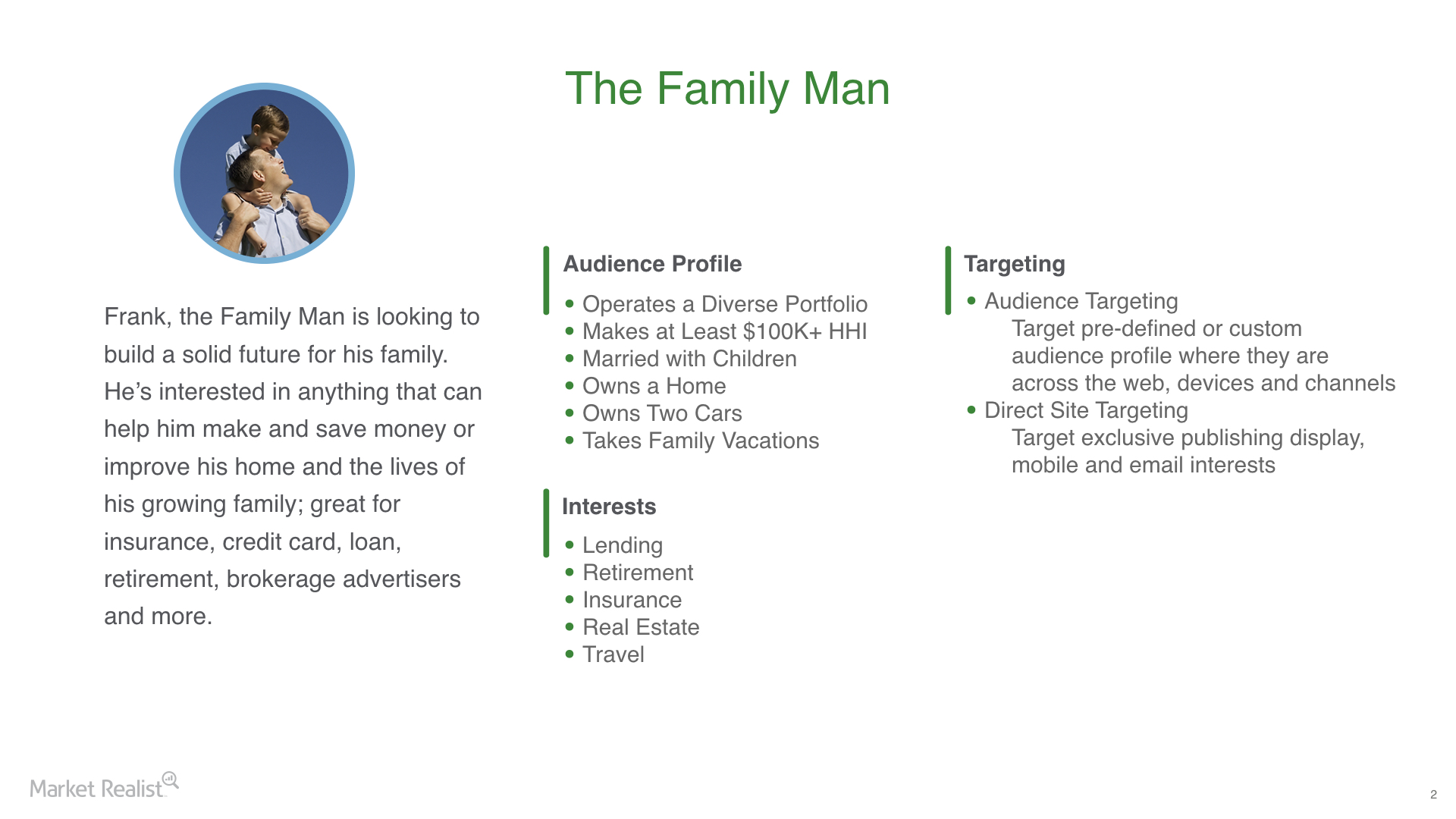
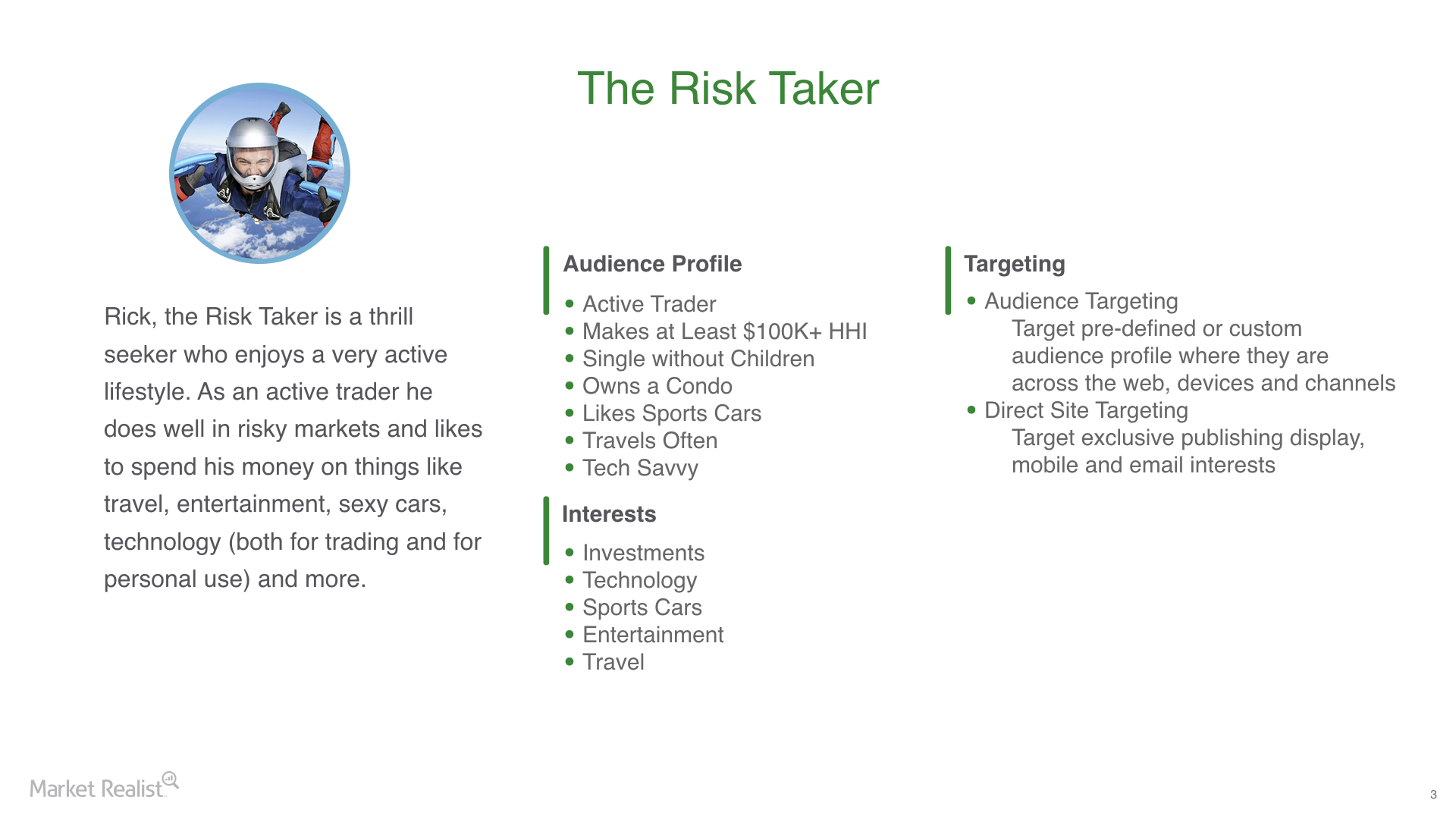
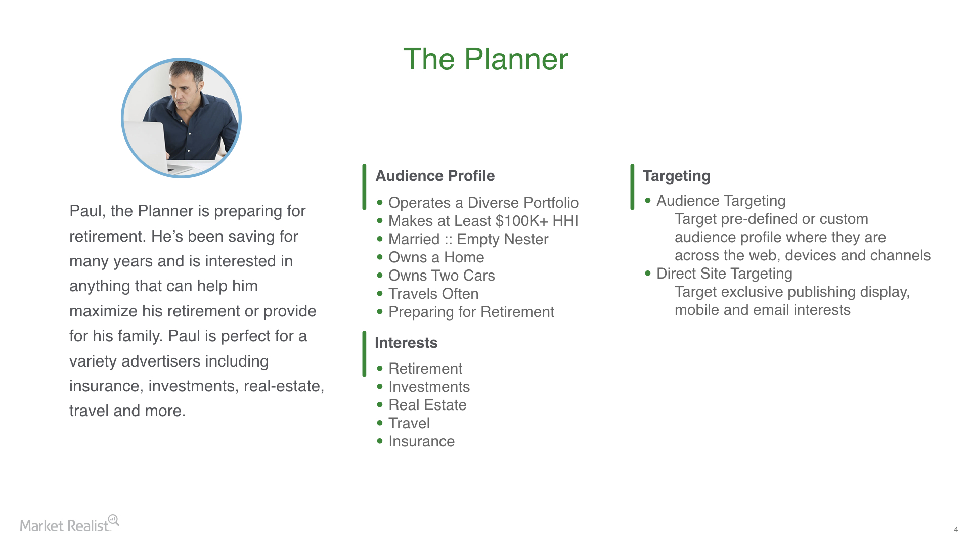
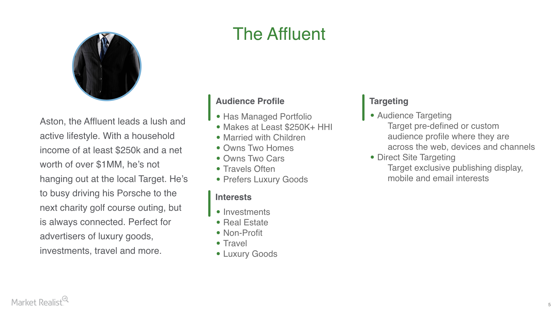
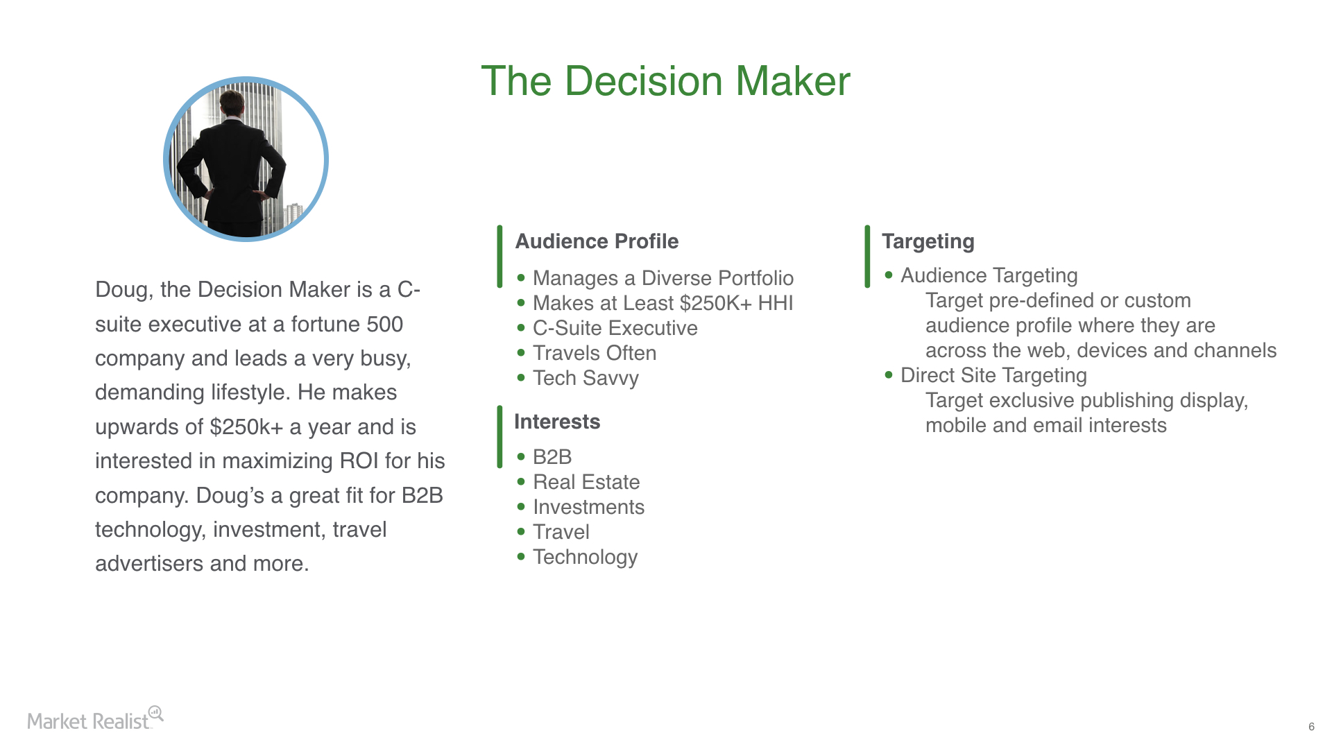
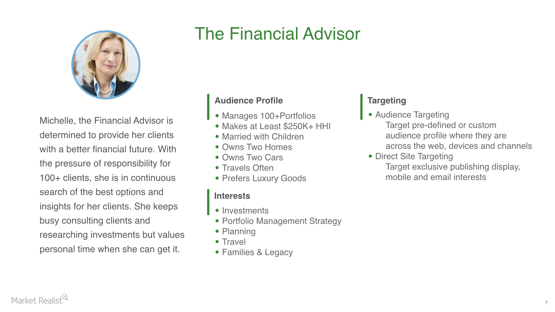
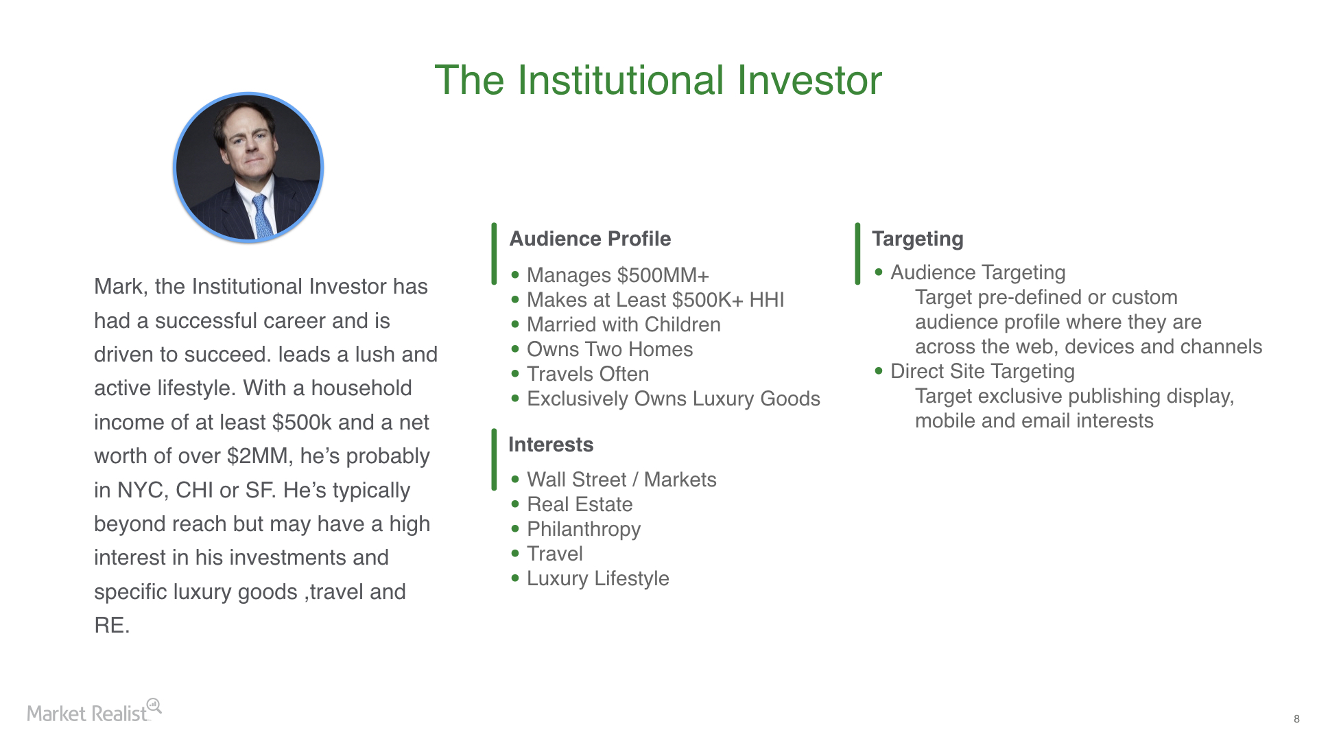
PERSONAS
One of the largest goals of Market Realist website 2.0 was to capture more information about their over 2 million unique users a month. Based on our research we established the following personas that ranged from the average investor to Financial Professionals:
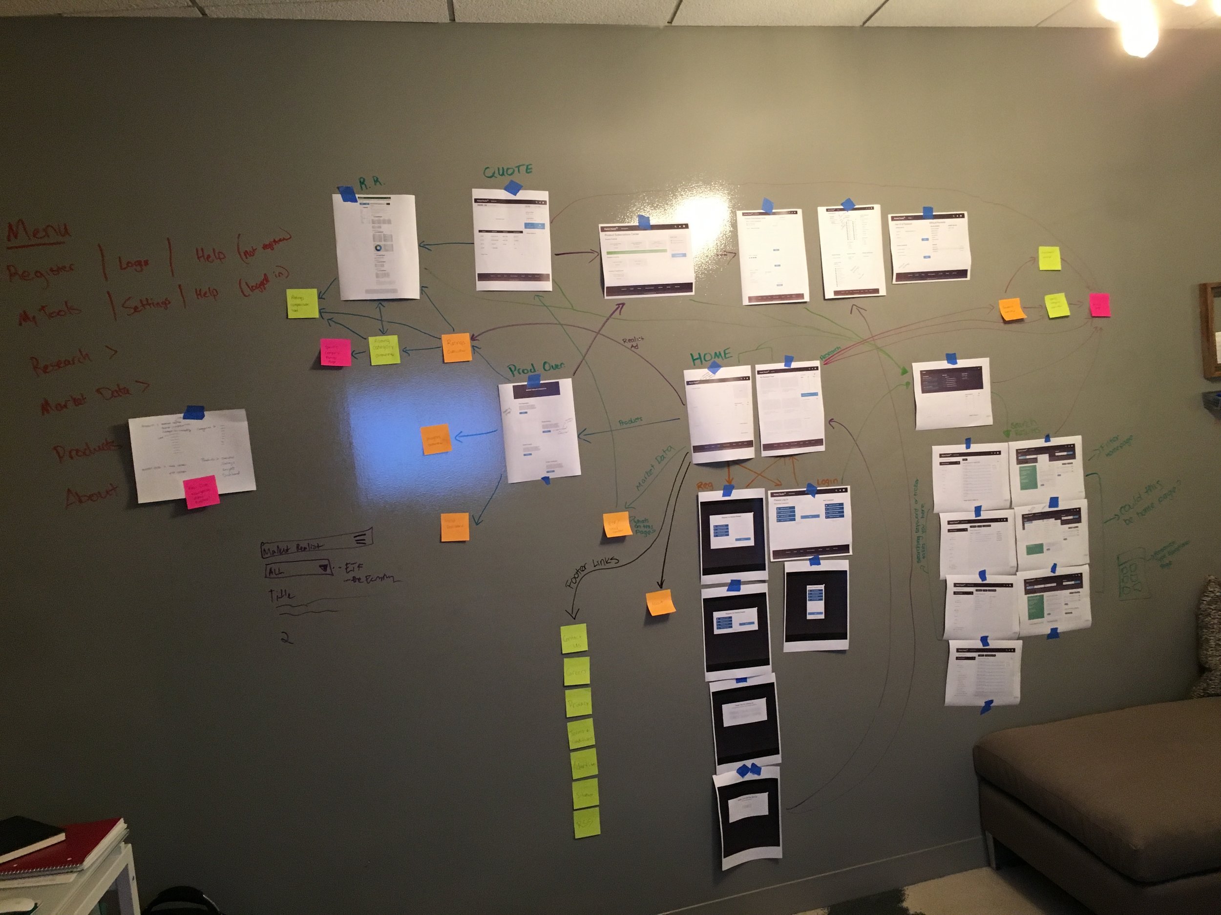
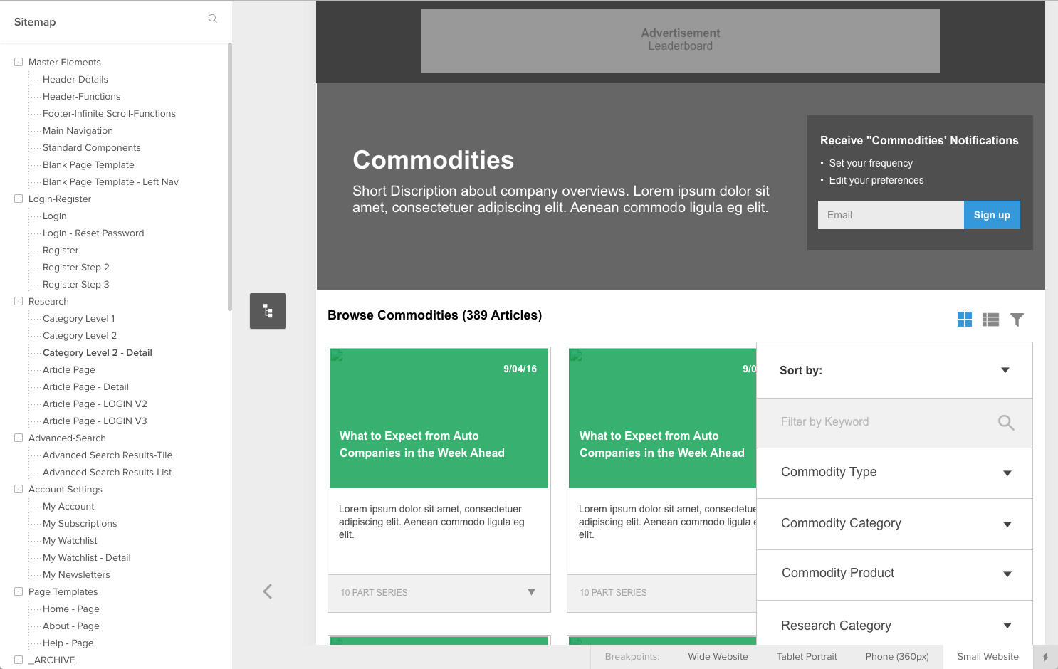
SiteMap
The first step of the redesign process was taking the document of requirements and establishing the site-map. We worked with Market Realist's Product Team and business stakeholders to narrow scope and define MVP.

User Flows
After the sitemap was established we worked to define user flows throughout the site. This is an example of the user flow for the registration process.
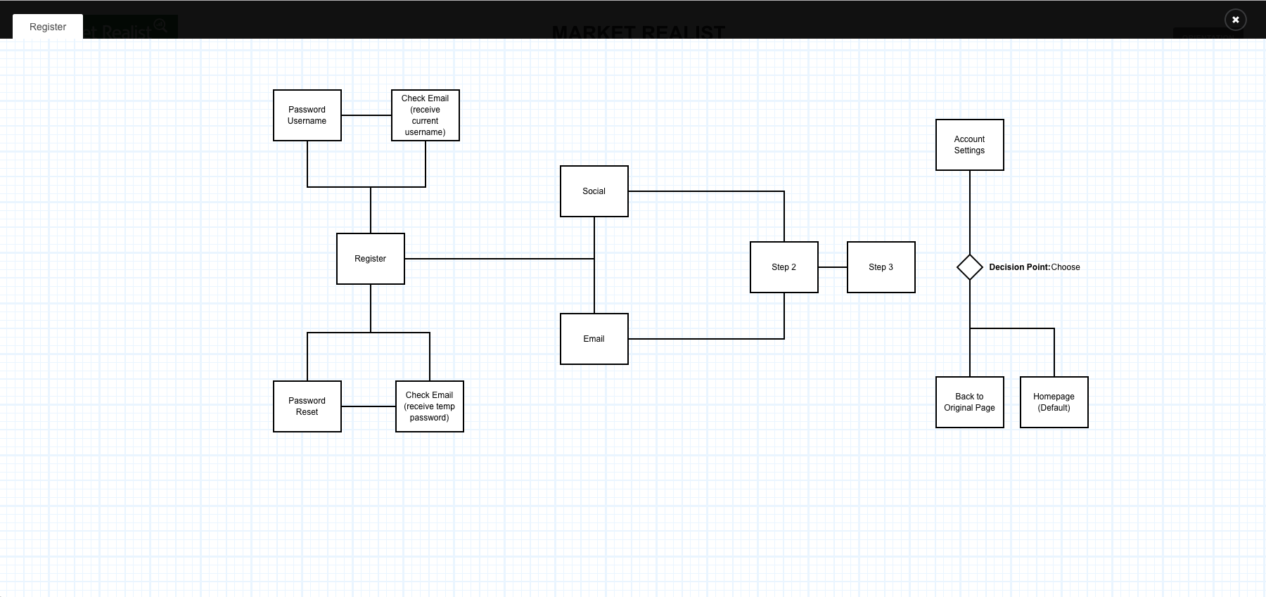
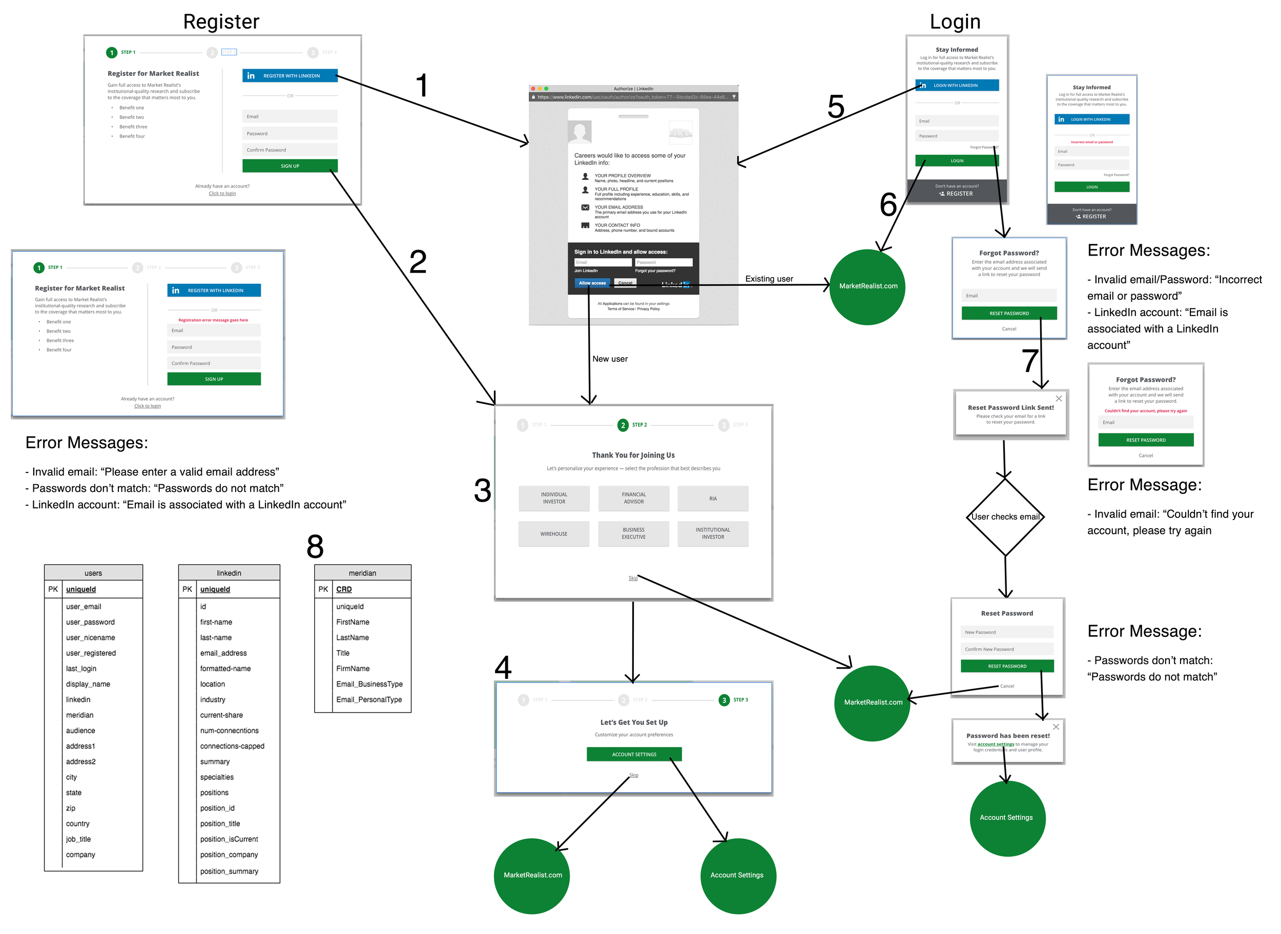
Throughout the process we would map out the site in order to find holes in page connectivity and missing components
Wireframes
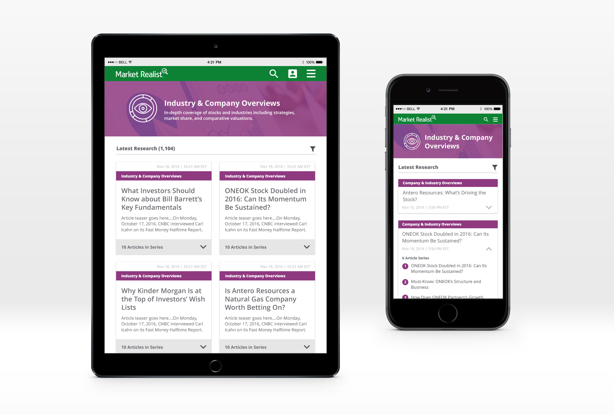
Next we moved into wireframes, prototyping and user testing using UXPin. We used a 12 column responsive grid and utilized Google's Material Design as a guide for responsive breakpoints and the new design of the website.
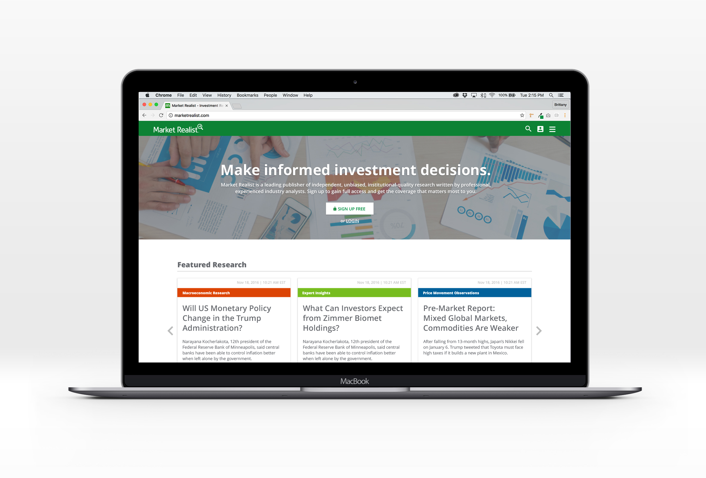
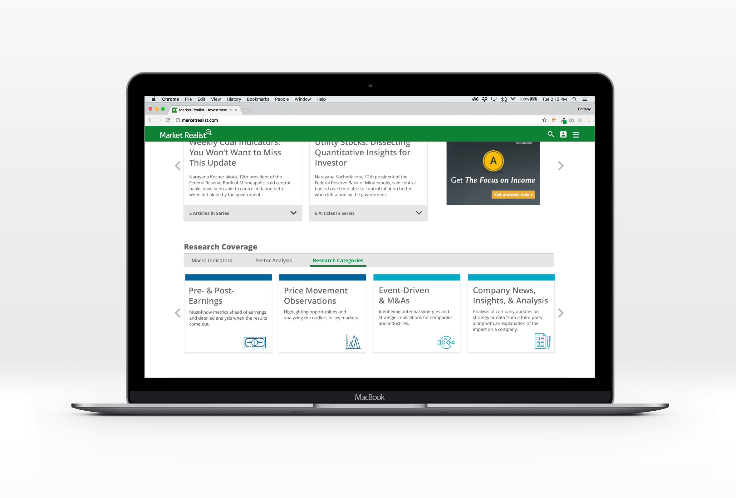
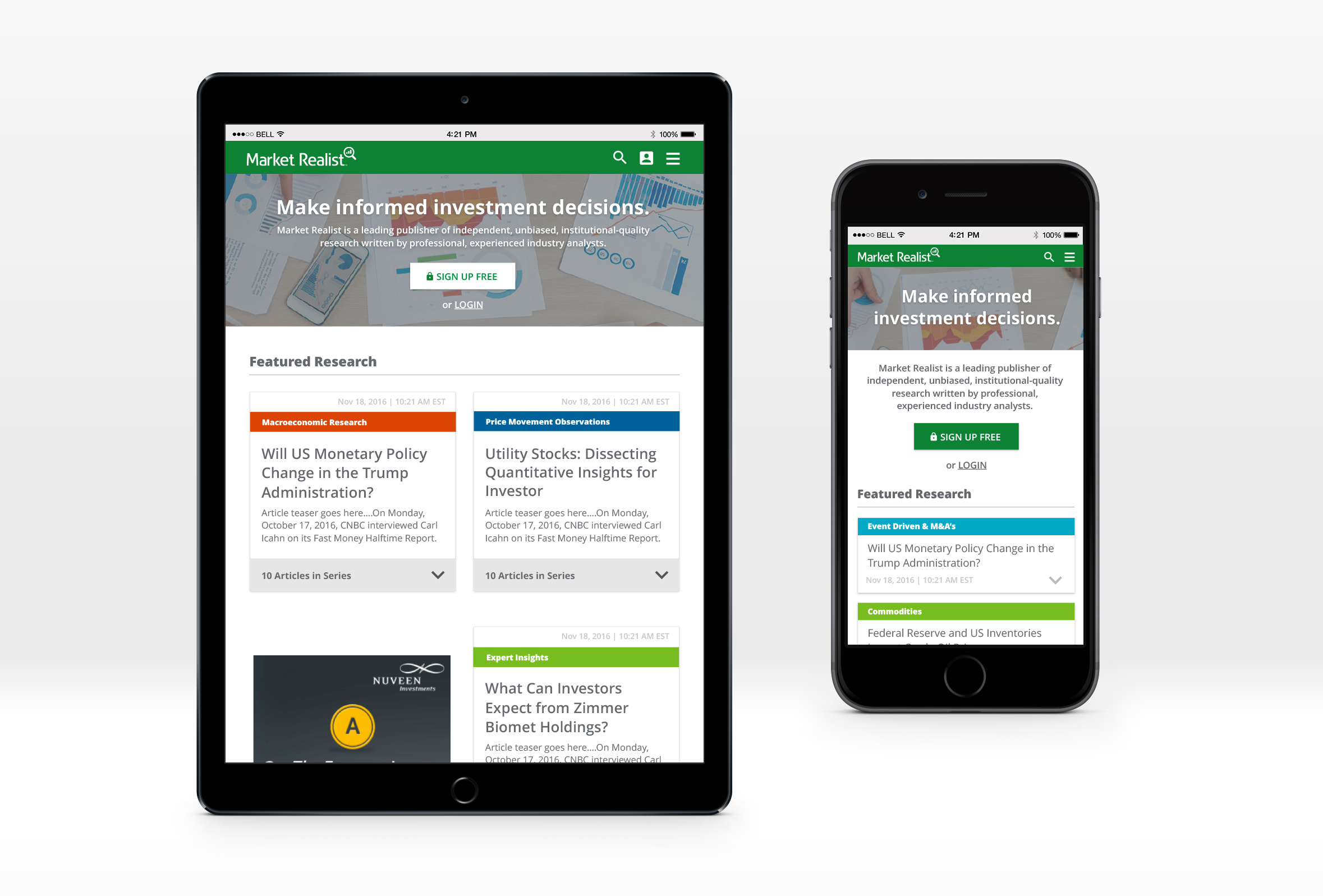
High fidelity: HOMEPAGE
Since majority of users currently enter the website through our article pages via a link from our distribution partners, the home page is usually the second stop in the user's journey. The main goal of the home page is to quickly let the user know who Market Realist is, entice them to register, display featured & latest research, educate the user on our research coverage, and drive traffic to other areas of the site.
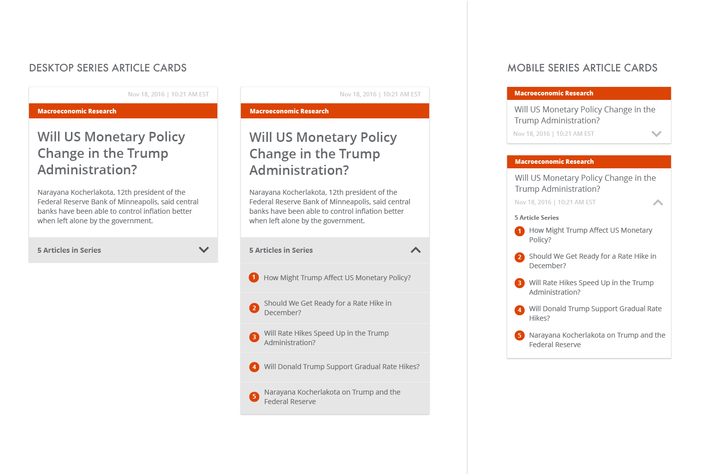
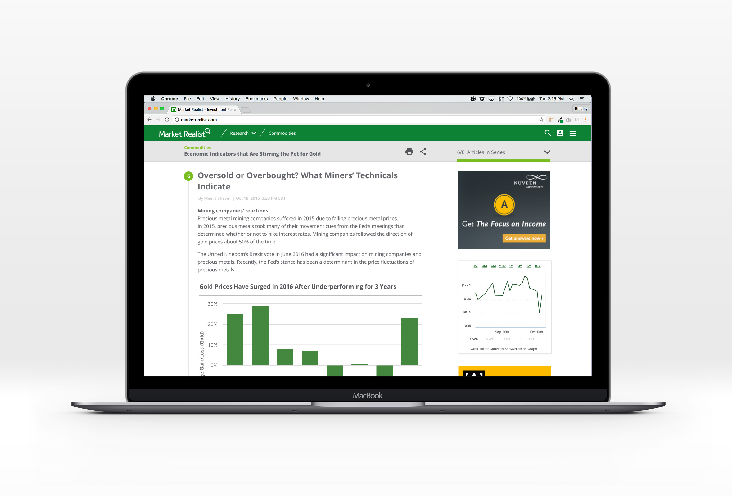
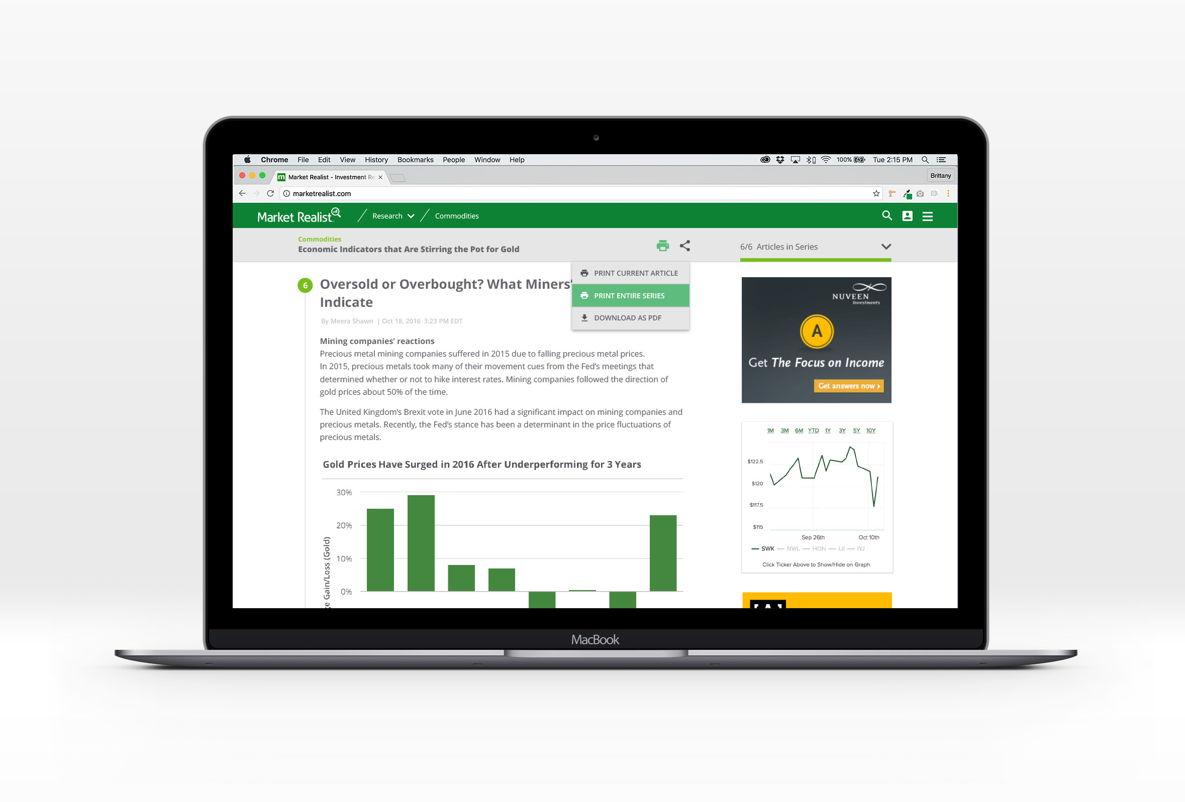
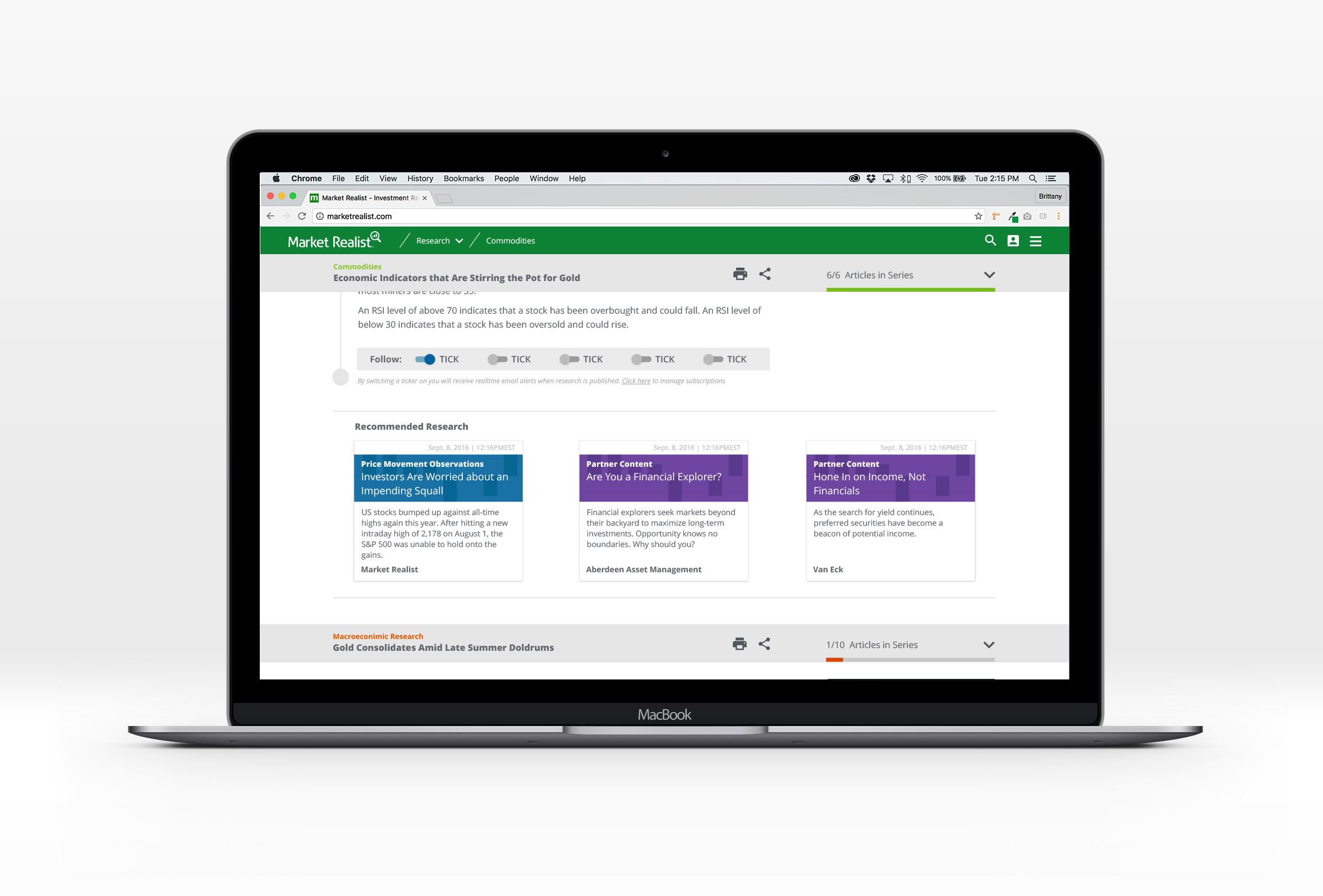
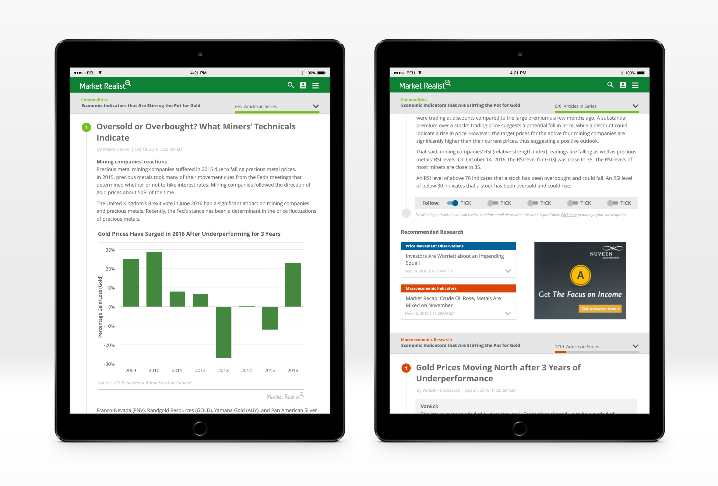
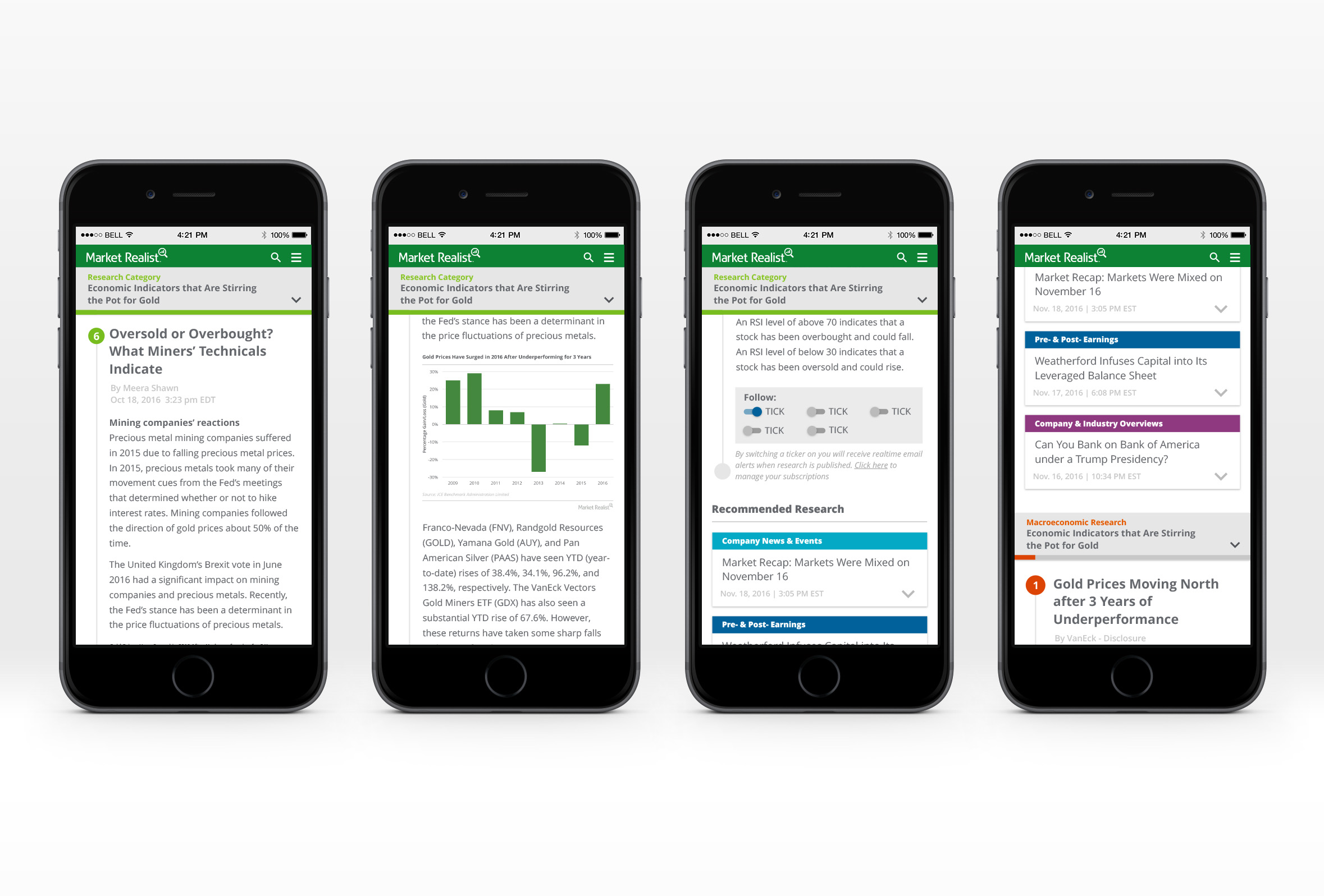
High fidelity: ARTICLE PAGES
Over 90% of current traffic enters Market Realist's website on an article page. Their research is unique in that all articles are published as parts of a series. The redesigned article pages provide visual cues to help the reader know where they are within a series and provide additional ways to navigate the site.
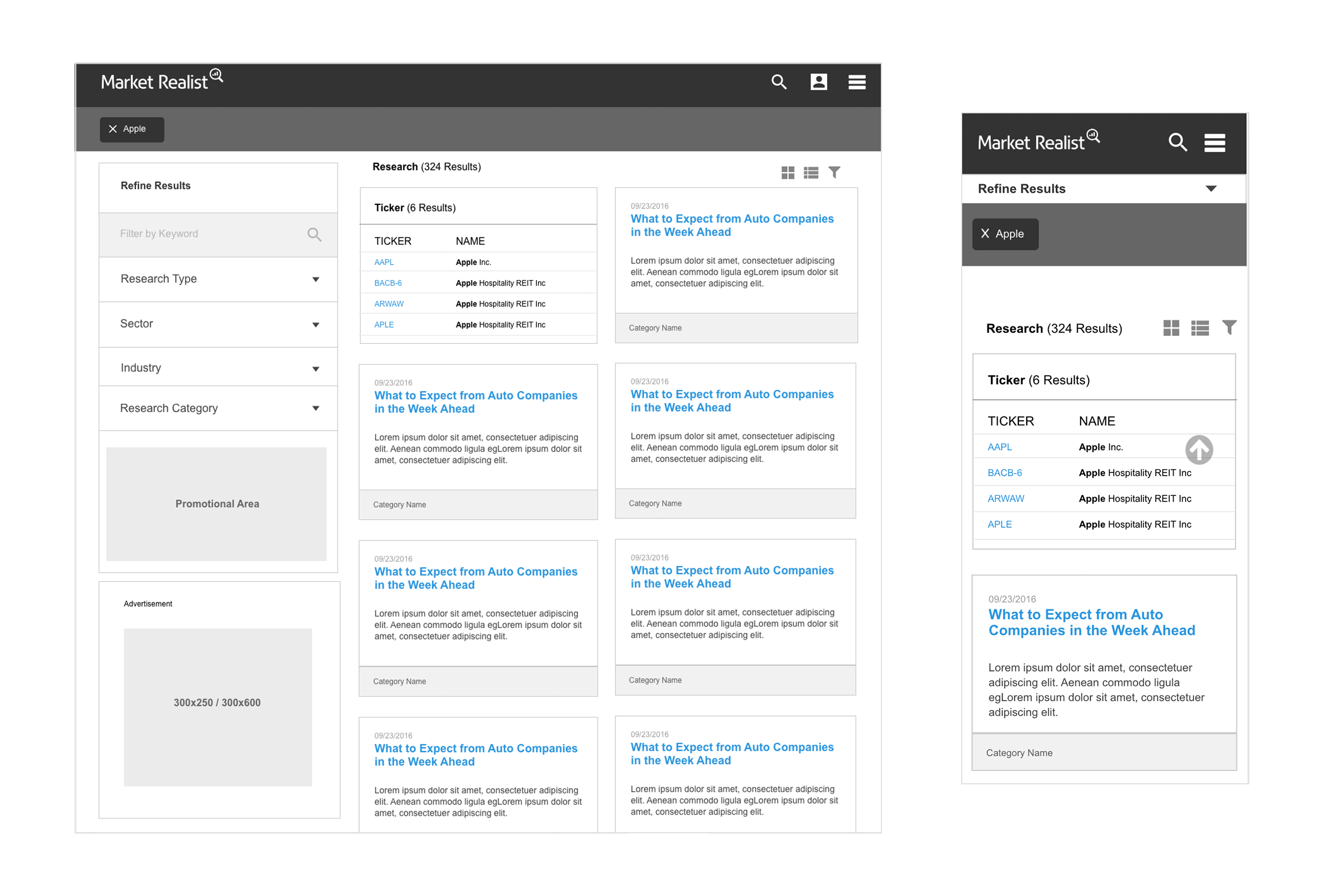
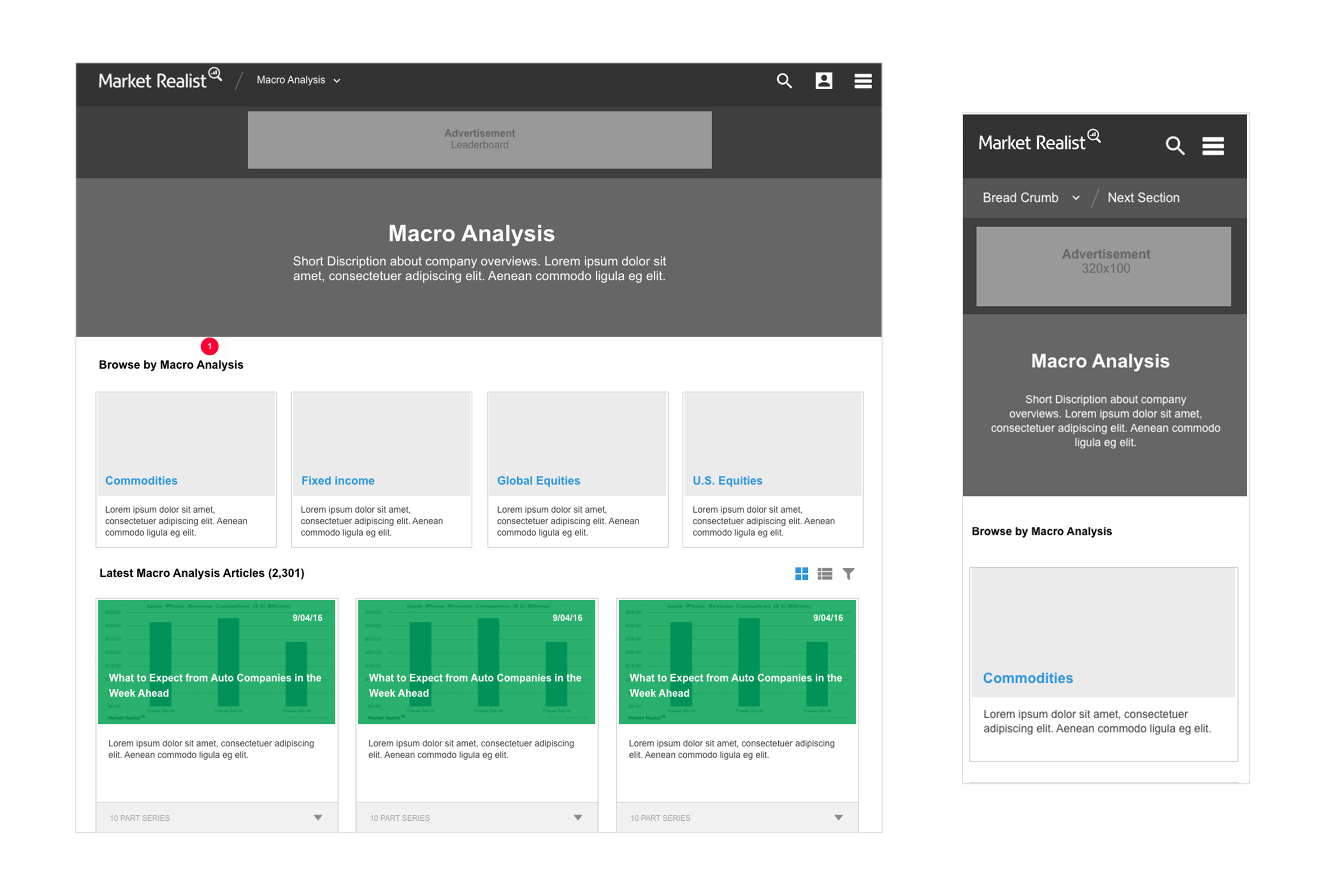
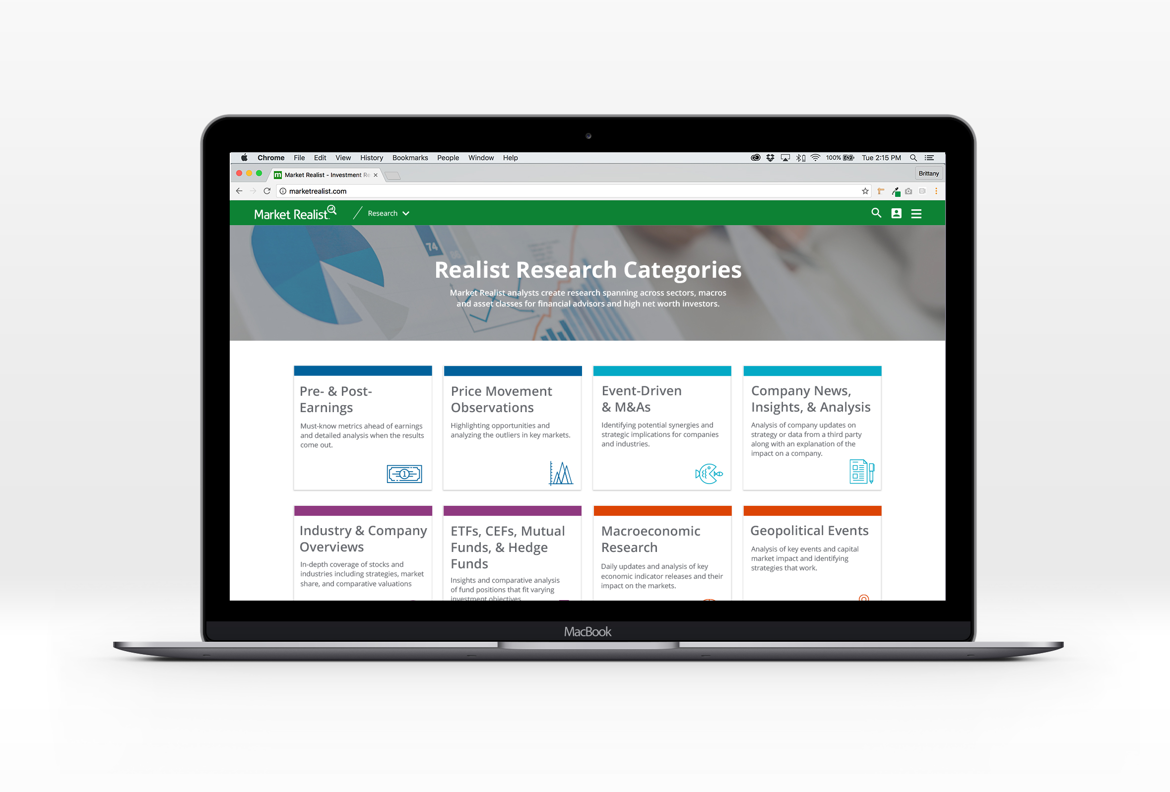
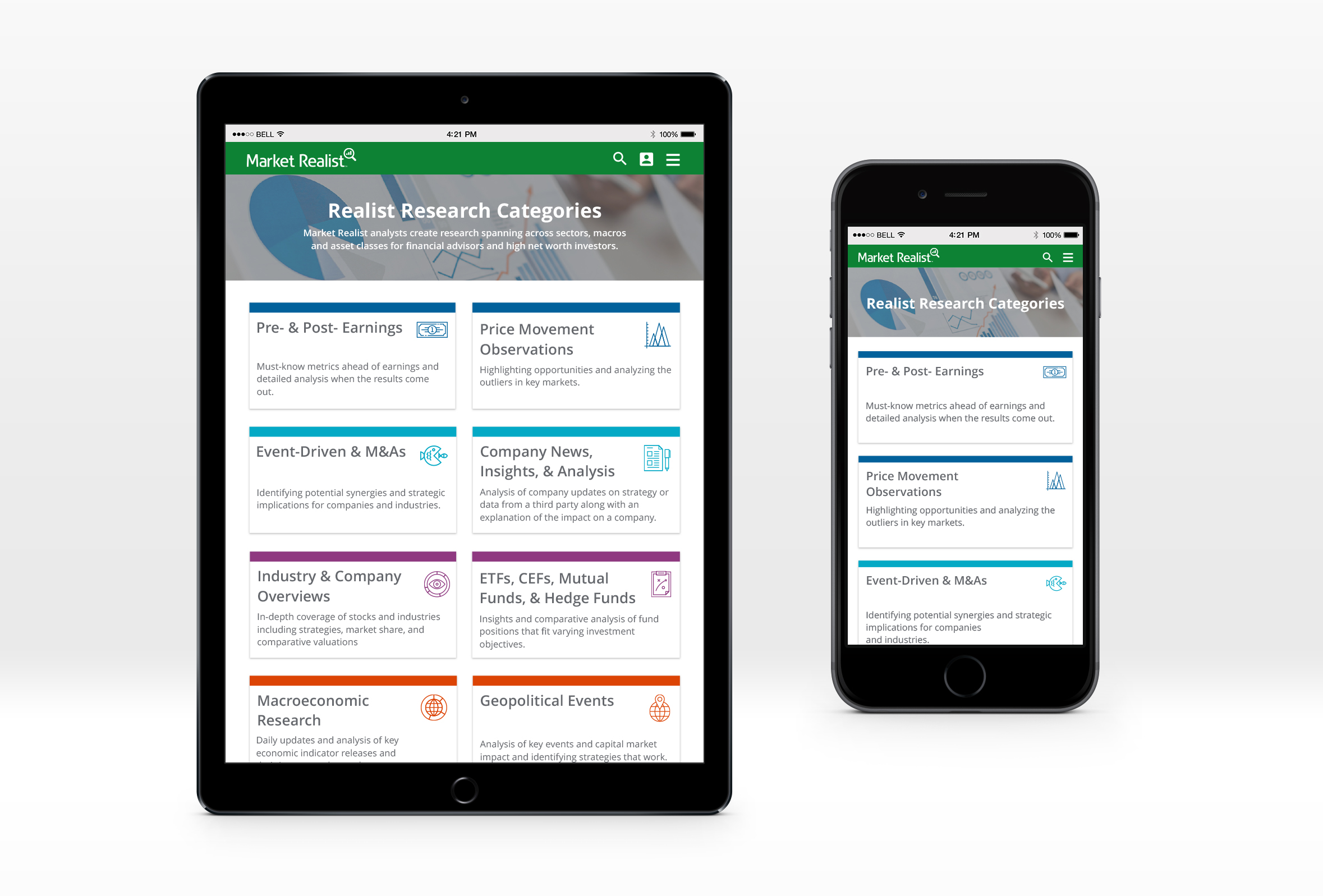
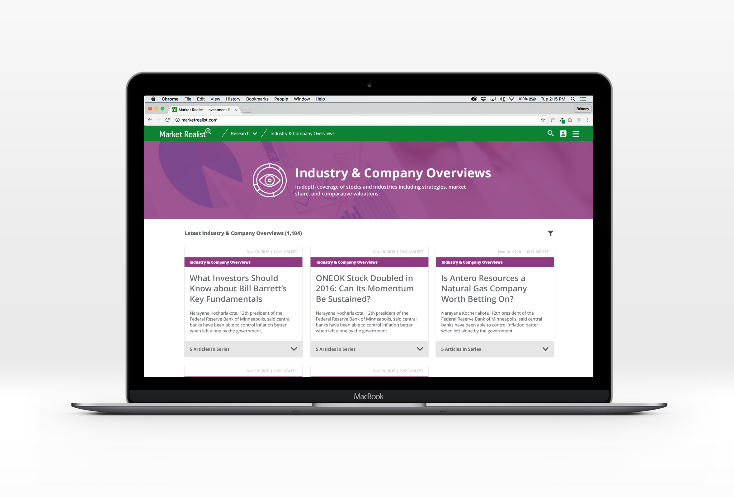
High fidelity: RESEARCH LANDING PAGES
A main focus for web 2.0 was improving the information architecture of the site to provide better organization of our research. These pages were created to provide the user with an interface to be able to browse research within the new taxonomy.
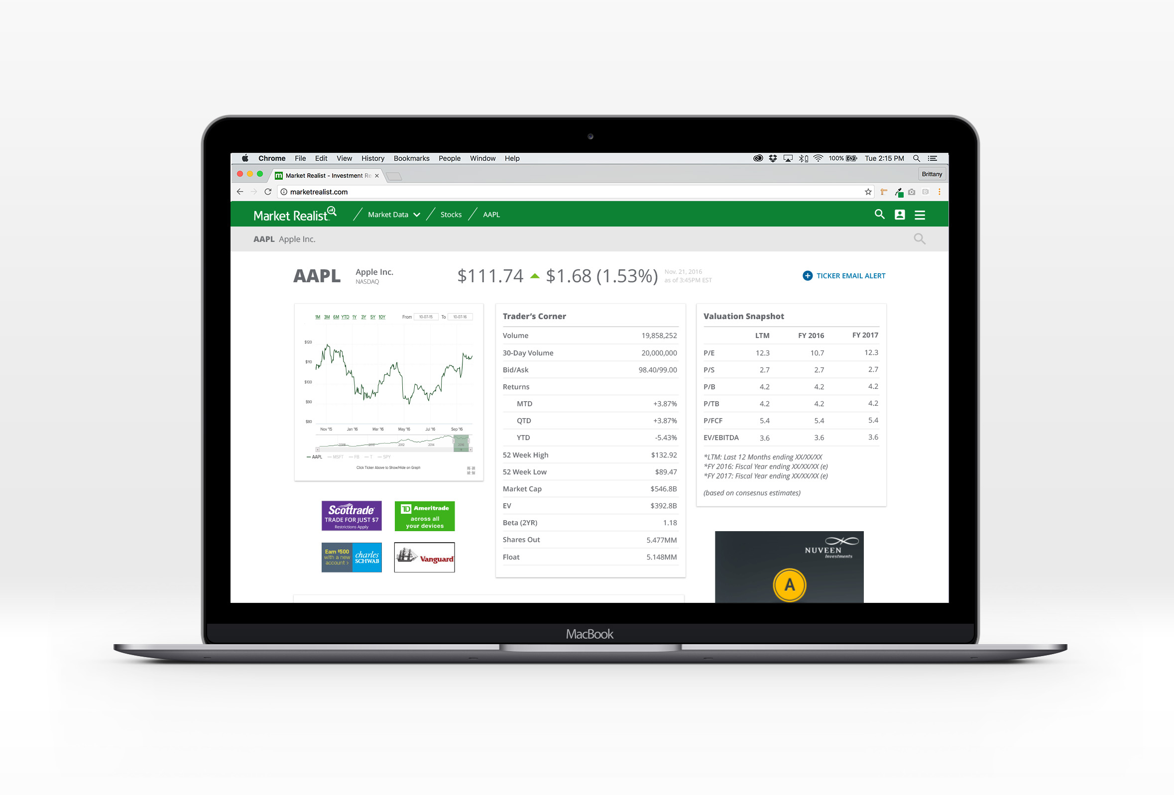
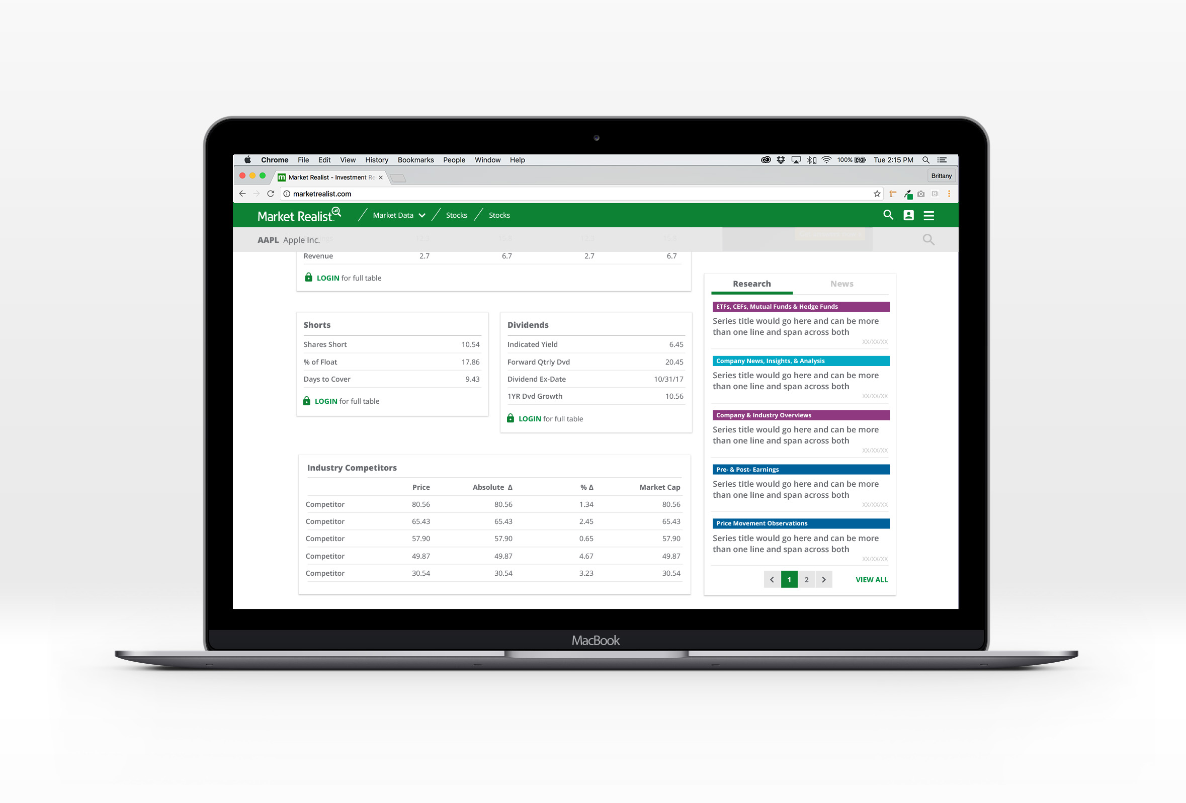
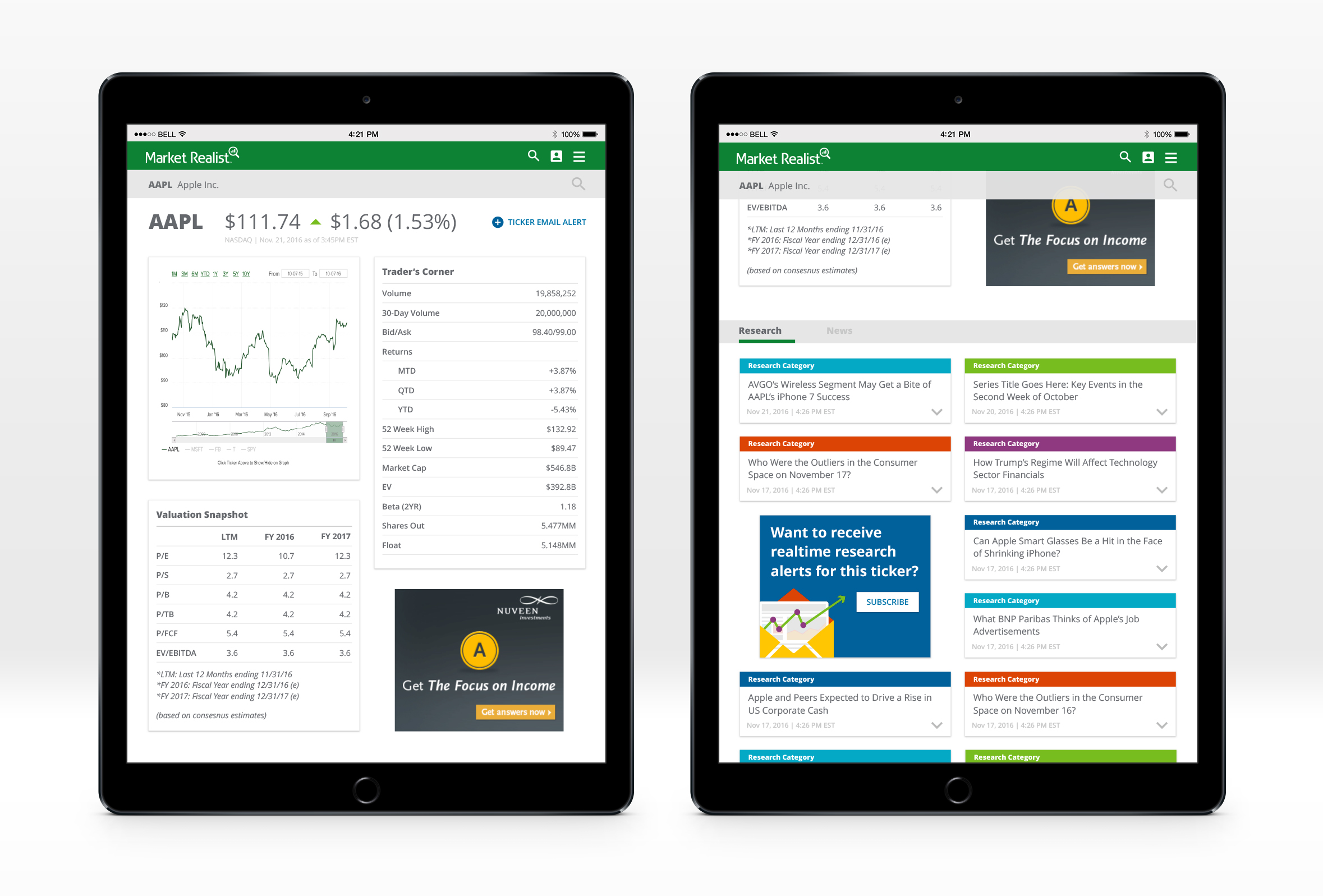
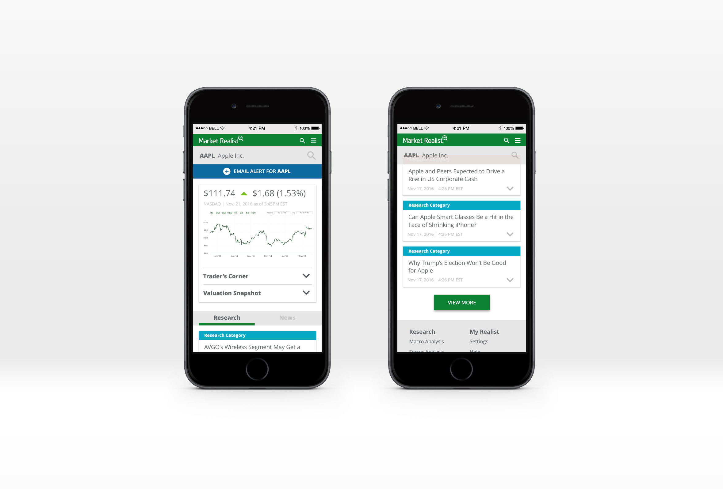
High fidelity: Quote pageS
We worked with one of our research experts that was previously a trader to develop a new quote page that would provide the information users care about most and make it easy to find.
WEB COMPONENTS
Here are some examples of different components utilized throughout the new site to improve the user experience