SAVO UI STYLE GUIDE
Coming into my role at SAVO, one of my first tasks was to define a strategy to bring visual consistency across the different products. As a step toward that goal, we developed a style guide that developers, designers, and other teams may use as a resource for visual styles, voice & tone, and UI components. This is a living, breathing entity that grows and evolves to adapt to the teams and products.

VISUAL STYLE
In the absence of any existing patterns or conventions, we evaluated the current state of the software and experimented with various elements including typography, color, and iconography. During this exploration, we validated style directions with users and internal stakeholders.


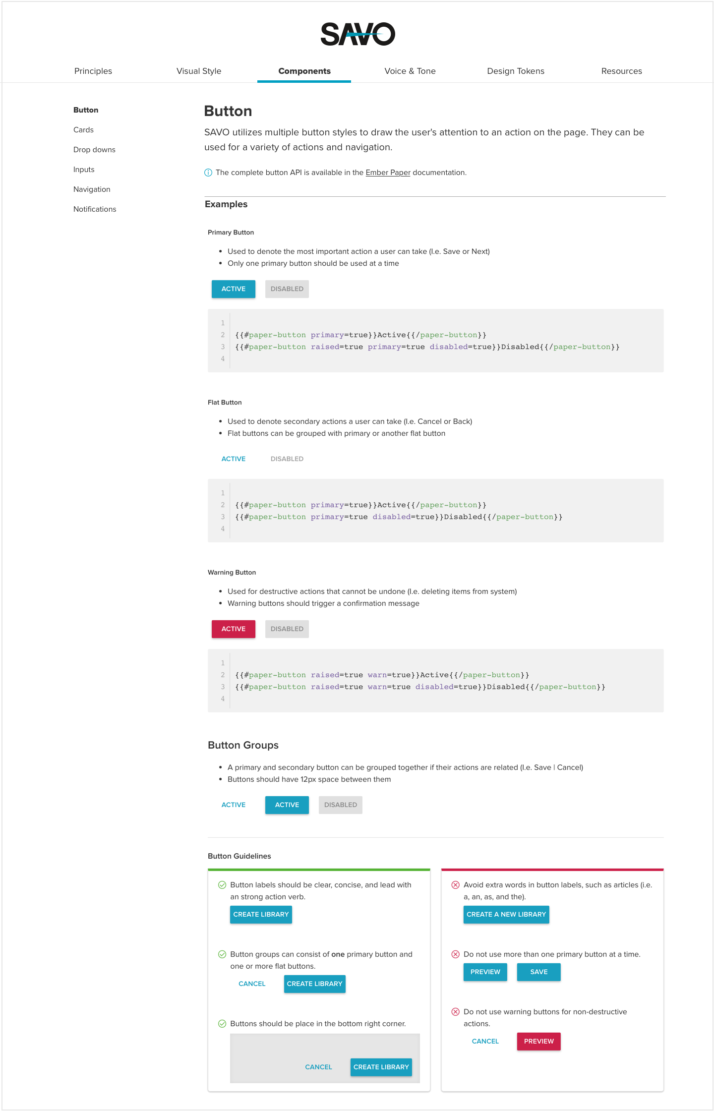
COMPONENTS
In close collaboration with UI developers, we composed these pages to define consistent implementation practices and provide contextual examples.
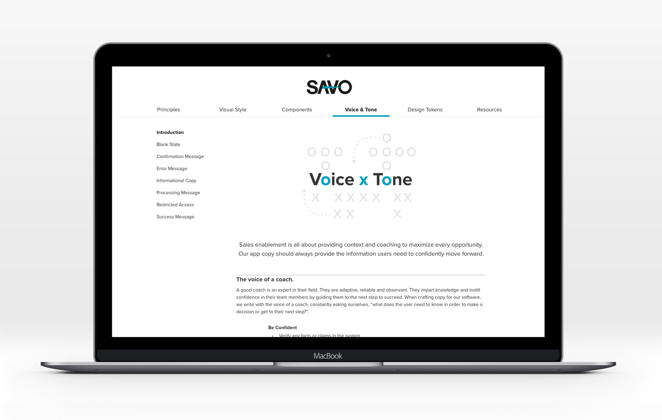
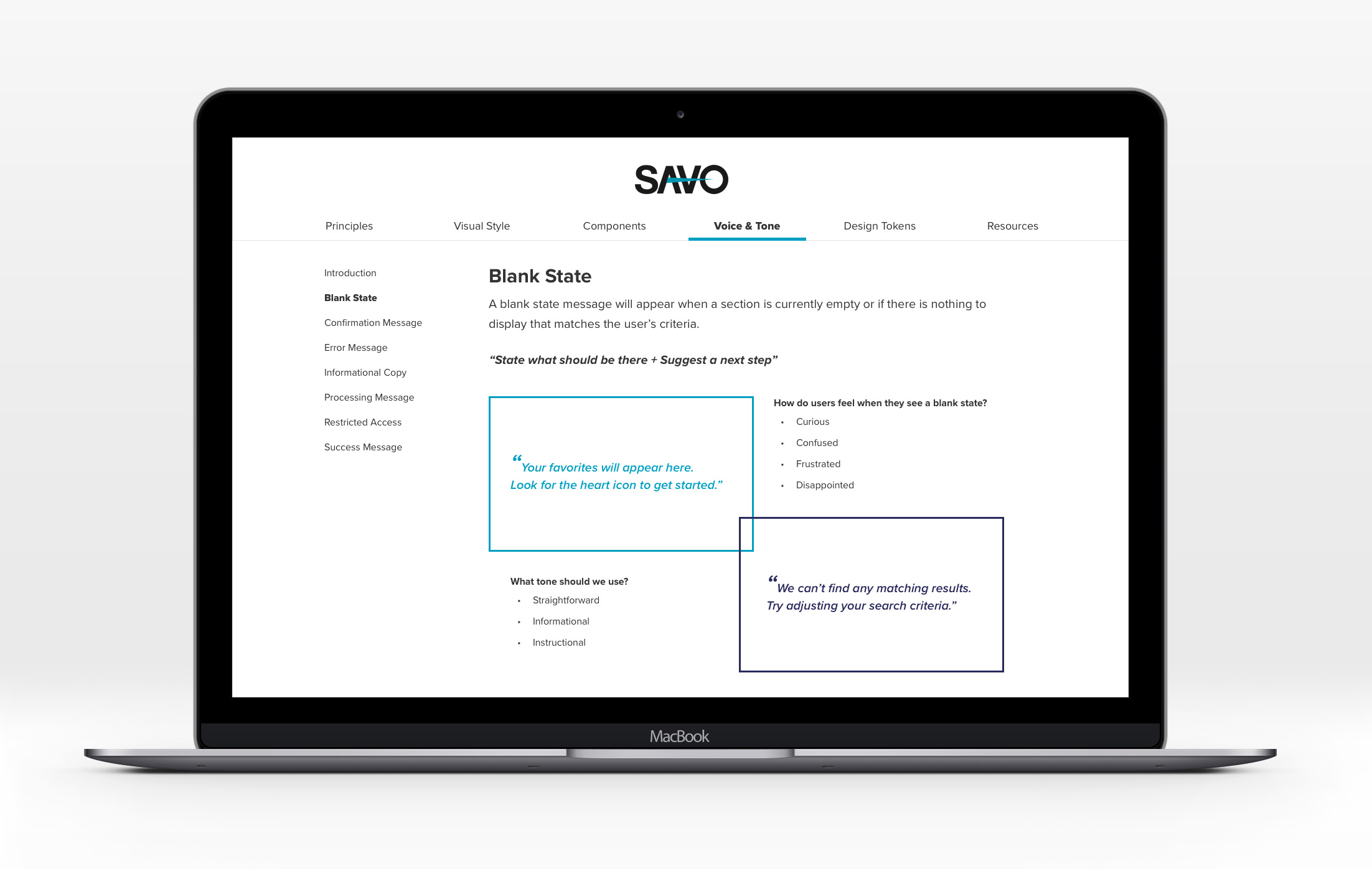
VOICE & TONE
Taking inspiration from MailChimp's approach to defining voice and tone, we ran a multi-day workshop with designers, marketers, customer support, and product owners, to define guidelines for our software. During this workshop we considered overall brand, our three broad personas, and situational examples.
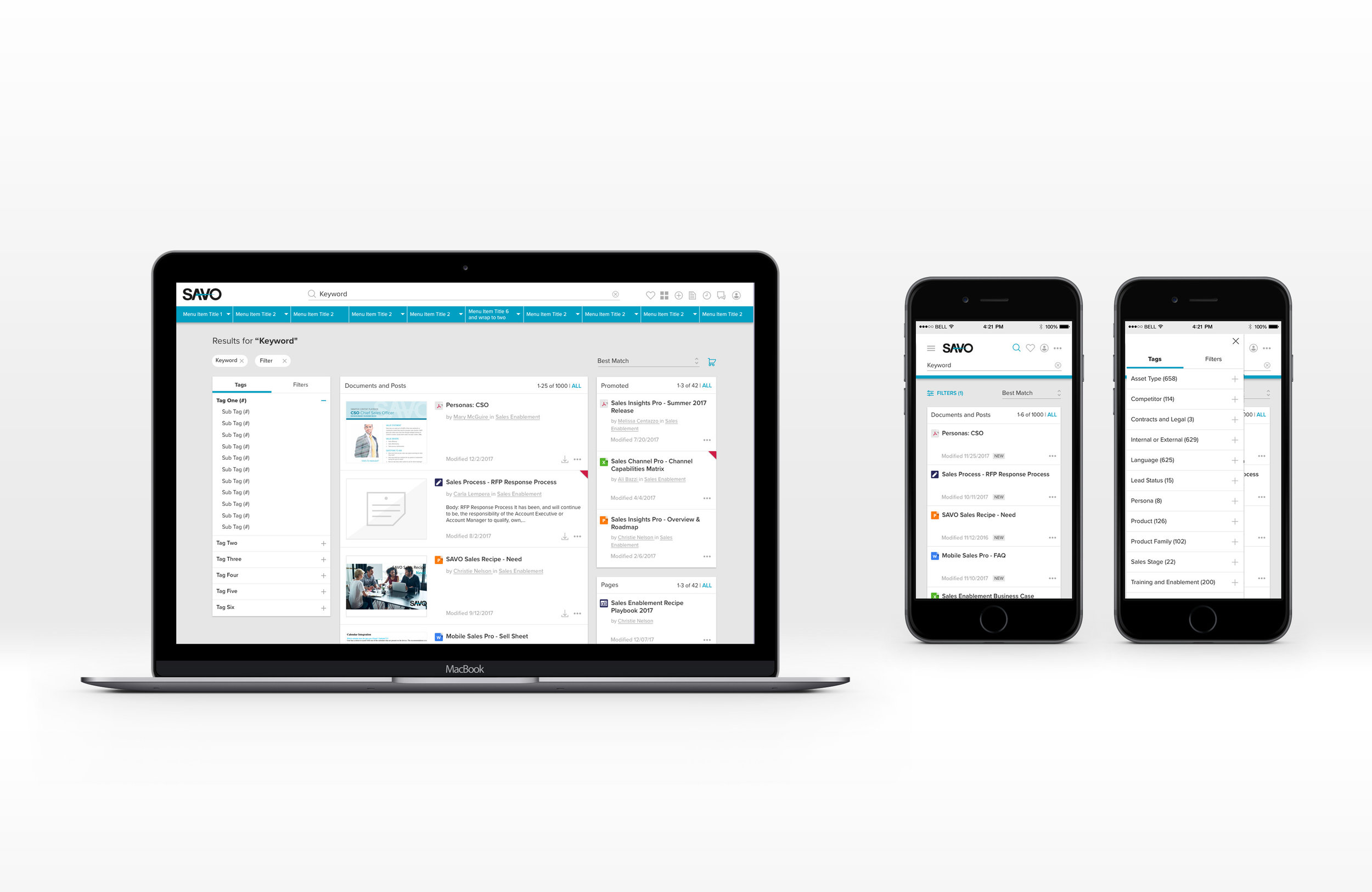
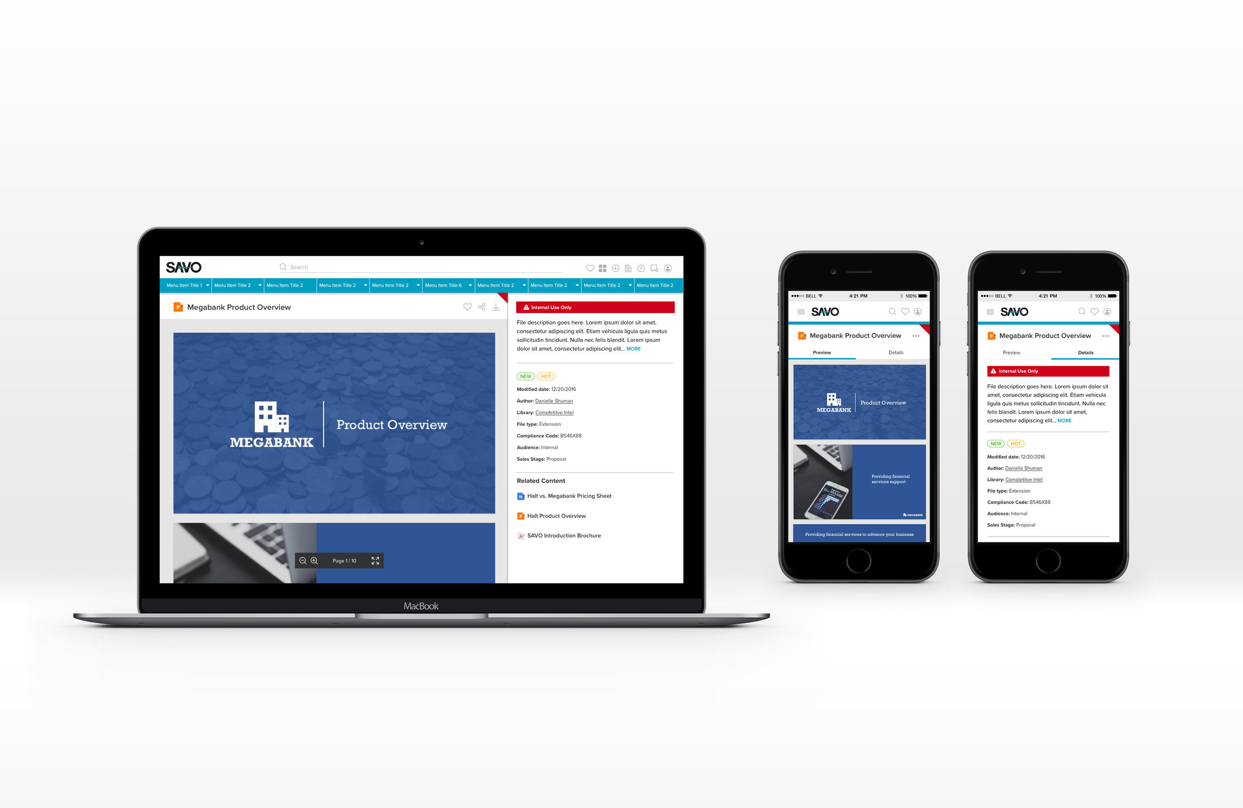
IMPLEMENTATION EXAMPLES